Sunday, 7 October 2012

OUGD502 // Areas of Interest

Group: 6 peers.

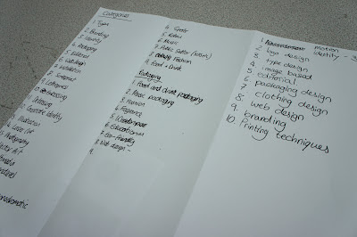
After defining 10 examples of design that illustrate my fields of creative interest. Our ten images were then collated, totalling a minimum amount of 60 images that we could analyse and dissect. Placing the imagery into various categories/ sub-categories - As you can see from the photograph below, we had an extensive list of categories, partly because not one single item fell under one specific label. 


E.gs'

Hand rendered illustration
Retail Branding
Fashion advertising
Magazine layout
Publications
Collage
Photo montage
Web design
Posters
Letterpress
Photography
Animation
Corporate identity

For example; 


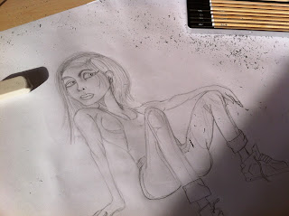
Some people might include the photograph above just under 'Photography' however  it displays many more aspects of creative fields than that... Illustration, Photography, Handcraft and 3D form. 

As a group we then tried to categorise and place the breadth of our findings into TEN specific niche's that represented a broad range of Graphic Design. Which was for the purpose of answering the following questions: 

Who is the client?
Who is the intended audience?
What is its function?
What is the budget?
Where is it from?
Who is the designer/ studio?

10 Filtered decisions/ Answers...

Corporate Brand Identity

- Who is the client? = Attido
- Who is the intended audience? = Business's that seek tailor made solutions to fit their customer needs
- What is its function? = To represent the brand and solve corporate problems, tailored specifically to that problem
- What is the budget? = HIGH - the website http://www.attido.com/en/ displays a large range of deliverables
- Where is it from? = It has bases in Finland, Latvia, Estonia & the UK
- Who is the designer/ Studio = Bond - design agency.


Football Branding/ Identity/ Sporting Industry/ typography.

Who is the client? = NIKE
Who is the intended audience? = The 2010 football season representing Nike football clubs, satisfying Football enthusiasts.
What is its function? = The San- Serif font displays a futuristic dynamic appearance which signifies that they're possibly trying to push boundaries as they're moving forward with their use of type. It's function is to represent their team accordingly.
What is the budget? = EXTENSIVE - Huge company - heat-pressed design. 
Who is the designer/ Studio = Stewart Scott Curran - http://www.onlymoreneverless.com 
Where is it from?  = Atlanta USA (Designer)


Logo design/ Branding  

Who is the client? = The High Brow www.thehighbrowsf.com
Who is the intended audience? = Men in need of a haircut who appreciate vintage, modern designs.
What is its function? = To Appeal to the modern Gent in a popular style.
What is the budget? = Probably not too large, but if you look at it from an Independant business's POV the cost could be quite substantial, minimising costs the designer was paid to only design her ideas and concepts.
Who is the designer/ Studio = Stylist; Shirley Tokuda & Ian Vadas designer = Collaboration
Where is it from?  = San Francisco


Food Packaging/ Branding / Advertising.

Who is the intended audience? = 'Nutastic people' who are attracted by brightly coloured packaging and stuck between the decision of these and KP Nuts.
What is its function? = To protect the product a swell as; Attract, Stand out and provide personalised fun 
What is the budget? =High - rebrand/ Illustrator employed, aswell as the creation of a whole new typeface.
Who is the designer/ Studio = International design agency Pentagram, lead by partner Michael Bierut, he created a new visual identity and packaging solution ‘that would help establish Nuts.com as a distinctive brand’. Based around a bright and distinctive colour palette, organic, heavy line-weight character illustrations (their hidden arms giving them a childlike cheek but innocent personality), a loose, ‘hand rendered’ proprietary typeface alongside an uncoated unbleached material choice, the design solution successfully mixes the playful, conversational and tactile to capture the brand’s youthful, personal and wholesome sensibility.
Where is it from?  = USA.


Global Corporate identity/ Branding/ Logo

Who is the client? = FedEx, Global Logistics.
Who is the intended audience? = General Global audience seeking the service of transportation. Public sector.
What is its function? = To represent the brand, its a syllabic abbreviation of the name of the company's original air division, Federal Express, which was used from 1973 until 2000. (Simple, recognisable, forward thinking & movement - conveys speed - transportation.
What is the budget? = Un-obtainable - Obviously high for the scale of the business as it's Global. But for the profit return, it might not be so bad, the company is obviously successful because its logo is voted in the top 5 most successful Brand logo, alongside McDonalds, Starbucks etc.
Who is the designer/ Studio = Richard Runyon 1973 - rebranded by Leader creative. 
Where is it from?  = USA


Motion graphics/ 3D/ Video editing/ Layout.

Who is the client? = Channel 4/ More 4
Who is the intended audience? = Public viewers/ People who own a television set
What is its function? = A lot of More4's programming is about making things and the creative aspect involved in this process. 'Man vs Machine' made these 'flippers' to eventuate this idea, the short film provides the channel with a brand identity and re-inforces the fact that your watching their channel, the thought of 'its better than other channels' shows through the effort/ passion and time put into their identity.
What is the budget? = High - Rebranding a channel, especially in this way would mean expenses would quickly buck up, due to the creation and filming of 'flippers'.
Who is the designer/ Studio = MANVSMACHINE - Design and Motion studio - www.manvsmachine.co.uk/
Where is it from?  = United Kingdom.


Photography/ Illustration/ 3D Form.

Who is the client? = Icon magazine
Who is the intended audience? = Designers/ Readers
What is its function? = To attractively illustrate the topic of Food, looking at the overlooked world of food design. Cover illustration for Icon magazine 104, concerning the Future of Food.  Inspired by 3D food printer technology.
What is the budget? = Low-scale, One off production.
Who is the designer/ Studio = French design and art studio 'Zim & Zou'
Where is it from?  = France.


Web design/ Layout & Composition

Who is the client? = James Griffin// blog - CMYKERN.com
Who is the intended audience? = Graphic Design enthusiasts & anyone interested in print and design with a graphic response.
What is its function? = To educate designers of other design work that is becoming popular. Educating them on new styles and new ways of working.
What is the budget? = Low - Designed and created for his own blog, meaning he didn't have any external costs because he was doing all the work himself.
Who is the designer/ Studio = James Griffin
Where is it from?  = West midlands //UK.


Editorial/ Page layout/ Composition, Photography

Who is the client? =  Premiss - political magazine
Who is the intended audience? = An Audience familiar with the subject of Politics
What is its function? = "As each edi­tion is theme based, we cre­ated a lay­erred feel­ing, mak­ing the theme the most impor­tant fea­ture of all — in front. In the mid­dle, we cre­ated a photo sec­tion on dif­fer­ent paper stock, invit­ing a new pho­tog­ra­pher or artist for each issue. This issues theme: privacy." 
What is the budget? = Medium (Depends on the quantity of their order) - Not a well known magazine but still a full issue design, which hasn't cut corners.
Who is the designer/ Studio = Heydays design studio - Amsterdam
Where is it from?  = Norway - Amsterdam 


Illustration/ Typography/ Photography/ Mixed Media.

Who is the client? =  Elm Cafe 
Who is the intended audience? = Readers of Elm Cafe's magazine. People who visit the cafe/ General public.
What is its function? = To promote an article in Elm Cafe's in-store magazine.
What is the budget? = Medium - Photographer and illustrator hired to create and develop the design you see above. 
Who is the designer/ Studio = Josh Holinaty and Aaron Pederson from http://3tenphoto.com. << A very interesting and dynamic webpage, appealing to my fields of creative interest.
Where is it from?  = Canada - Edmonton.

Wednesday, 26 September 2012

Why Am I Here - What do I want to Learn? - Study task 1

5 reasons why you chose this programme...

  • The courses reputation - The End of Year shows consisted of a very high standard of work & My tutor at Winstanley Art Foundation also emphasised; 'If you want to come out of university and have the knowledge of what to do and where to go, LCA should be your choice'. When you leave this course you don't just leave with a degree, but with an awareness, a sense of speciality and the knowledge to put your talents into practice.
  • The opportunities available at LCA - After attending an open day, I was aware of the Colleges facilities and the resources available to its students, it has a very extensive range of facilities including Mac rooms, print rooms, libraries etc// it felt like a place that had focus, and a place that was serious about their work, which even shows through the actual architecture of the campus. Whatever your direction, you'll be catered for.
  • The quality and standard of work from previous students - You get a real feel for the drive & determination behind the students designs, seeing the results of hard work just made the course more appealing. Before you were even accepted onto the course, the teachers were testing you, setting summer projects and one-on-one interviews. But its because of this that you can see how proud and passionate the tutors are, it seemed like they'd literally help in anyway they could to ensure you succeed. 
  • The location of its Campus, Leeds - A-swell as having a thriving Student lifestyle, it wasn't too far from home!
  • Good links with the Industry - This was the main reason I chose to study on this programme... without good links in the Industry, all the hard work might not pay off at the end. 

5 things you want to learn...

  • Web design - At the moment this is all a mystery to me but I'd love to be able to design a website that can combine both design and content seamlessly, similar to the example below. Being able to  design a website to a high standard will definitely broaden my creative prospects. During this age, everything is becoming online...which means everything will subsequently need a website to offer their service through.

  • Professional presenting - Public speaking has always been an issue for me, I don't know what happens, but the nerves always get the better of me, a frustrating issue when you've spent so long producing a design and can't communicate its purpose effectively. However I think with practice, my nerves will be eased... as Daunting as that sounds. It may only seem like a small factor of the course but its definitely a skill that will put us above other designers, knowing the correct language to use and technical aspects to comment upon will give you the opportunity to be taken seriously.
  • The key concepts of Branding - Although I understand the basics of Branding, I know there's a lot more to creating a sense of culture, vision and personality through minimal elements. To do this successfully will also involve a broad knowledge of print production, which is vital for this industry.

  • Effective blogging - Instead of continuously scrolling and struggling to arrange elements, I want to be able to display my work in an easy and accessible way, using all the resources possible...


  • How to put a portfolio together successfully and self promote - I need to get my name out there, but at the same time, I need to be careful about how I do it. In my opinion I don't think there's any point to start getting my name out there when I don't have a bulk of good work, simply because if I did...I'd just be another graphic designer taking advantage of every social networking platform and design platform. I want my work to be striking and cause a commotion.


5 things you want to improve...

  • Planning and Organisation - Although this has been drastically improved, I need to implement a weekly plan that'll make sure I'm spending my time wisely as well as my money. I've learnt it's not about how much work you do, it's about how effective and efficient the work your doing is. Implementing these principles will make sure my blog is up to scratch, for every day.
  • My scope of drawings - Although I'm happy with my illustrations I need to develop them and alter their components continuously, doing this will give me a wider scope of choice when it comes to designing my finals. I'm learning to work outside of my comfort zone and produce illustrations that aren't the core aspect of my designs.
  • My knowledge of different creative fields - learning more about different creative fields will certainly improve my outcomes, widen target audiences and possibly provide me with a design direction for my work, collaborating with people from different classes would be a good starting point.

  • Tutors perception of myself - I need to work to the fullest of my ability and not take the opportunity and chance I've been given for granted. There was a massive amount of applicants and I always think...Why should I be here...if someone is willing to work harder than me.
  • Ability to collaborate - Instead of jumping into a generation of ideas, time should be taken to really analyse our skills sets as a group and implement tasks based on these attributes.
  • Public speaking - Although it's going to be hard I need to put all of my nerves aside and concentrate on the communication of my ideas, which is affected as a result of this.
  • My knowledge of binding techniques - Everything moved up a tier and so should the delivery of my work, stapling and ring binding are out of the picture as of now. I need to start using printing services and techniques such as chinese binds to produce a professional and flawless outcome.

5 skills you think are your strengths...

  • Abilities to draw and Illustrate - Although I can illustrate, I still need to recognise when drawing can become too involved with a design, a good example of this would be 'Level 04 - Speaking from experience'. The communication of the design became complicated through the illustrations because they were much more pronounced than the actual content of my design.


  • Knowledge of Artists & Designers - Because I've been involved with creative subjects since high school, my knowledge of Artists has grown over the years, however I still need to delve into other designers and not just stick with the ordinary, this will develop my work and give it more individuality as oppose to being inspired by the same resources others are.
  • Using software such as Illustrator and Photoshop - 'Practice makes perfect'
  • The relationship between colour, format and layout - I feel confident arranging elements and communicating a certain message, enhancing its clarity through colours and size. The 'colour theory' sessions have definitely given me a better understanding of what compliments eachother.
  • Motivation for better outcomes - A major factor that spurred me on through the first year was seeing how far I'd developed as a designer, this year I'm going to make sure I take full advantage of the resources and environment around me.
  • Idea generation - I can efficiently generate various design ideas however I need to start broadcasting my ideas more effectively, just because I know what I'm doing, it doesn't mean others will understand how I've gotten there. Going through the design process step by step gives me the confidence to generate innovative ideas for my projects and allows me to think outside of the box.
5 questions that you want to find the answer to...

  • The best techniques to adopt when using different design processes - e.g. Is it possible to apply gold foiling to materials such as perspex...or even wood? Is it possible to laser cut a design into wood and add text using foiling?
  • How to effectively accomplish certain procedures in Photoshop for e.g. Half tone - This can be amended by asking the Computer resource team. After actually understanding their abilities, I'll be sure to ask them many questions...not just when a problem arises.
  • Will I get a job in the industry on a consistent wage...
  • How do I broaden my skill set to maximise job prospects...
  • What're the perfect books for my Essay questions - For the Level 04 essay question I was really disappointed. I didn't know why I'd received that amount of marks, I'd referenced all of my sources appropriately and developed my response, following on from my One-to-One with Richard Miles.

5 ways to evaluate your progress...

  • Peer review assessment - In my opinion I feel this is the best way to evaluate your progress because it allows people to assess your work in a comfortable environment so they're more likely to give you useful information, it also allows you to expand on their comments and review their progress.
  • Self assessment - A useful tool but it's often open to bias
  • Critiques- A hit or miss scenario when it comes to CRITS, sometimes you walk away with so much feedback you don't know what to do with it, other times, you walk away with nothing but confusion.
  • Tutorials - Not only do these provide you with a step-by-step guide to complete a task, they also let you know how far you can actually proceed before you need help with your progress.
  • One-to-one's.
  • Constructive criticism among a small selection of designers.

Common questions...

  • How did the course gain such a good reputation?
  • How can I improve time management/ punctuality?
  • How do I improve essay writing skills?
  • How do we learn web & general software skills?
  • What rates do we charge?
  • Will I make it?
  • How can I evaluate/ Reflect progress
  • Gain more confidence whilst presenting?
  • What do I want to specialise in?
  • How do I become better informed of whats going on in the industry?

10 problems that might arise in Level 05...

  • Unable to find a suitable placement?
  • Managing a larger work load
  • What if I don't pass all of the modules?
  • The essay might prove problematic
  • Tackling new design processes
  • Money problems
  • Printing problems
  • Stress/ overworking
  • Blogging
  • House problems e.g. Bills & Spills.

----------------------------------------------------

Identify & Explain 5 things that Inspire you...

  • Films - The concepts, images, inspirational dialogues and CGI most films implore always inspire my creativeness. E.g. After watching the 'Transformers' trilogy, I vividly imagined vehicles morphing into anything and everything.
  • Everyday scenarios - Being in a certain place at a certain time, playing a certain song. Could be all it takes.
  • Artists/ Illustrators - The breadth of artists & Illustrators is unreal, as is the standard of their work...and it's only going to get better. I want to be part of the 'Up & Coming' talent of todays generation.
  • The future - Knowing that my sense of living and quality of life could be effected by the decisions I make over these next two years is a daunting but exciting experience.
  • Peers work - Being surrounded by other designers definitely adds to the competitiveness and quality of work in the studio, Seeing their work and how they've improved also acts on your own ability to improve your work.

Identify 10 examples of design that illustrate your fields of creative interest...


Adidas Originals, creative Illustration/ Logo development.


Installations/ Murals.


Corporate branding.


Signage and way-finding.


Handcrafted for Photographic outcomes.


Creative/ Innovative outcomes.


Photography.


Collaborations. 


3D Innovative form.


Dynamic Packaging.


Monday, 28 May 2012

Different methods of Advertising

Visual communication concludes of ideas and information portrayed through imagery. A Visual message has a greater power to inform when accompanied by text and can be produced in many forms, for example; Graphic Design, Illustration, Typography and Signs...


Blimps are best known today for their role as advertising and promotional vehicles.  Goodyear began using blimps to advertise their brand in 1925. They're eye-catching, easy-to-use, easy-to-inflate, and easy-to- store and use again. Their bright colors and their recognizable shape immediately draw attention.


The proportion of red makes the design clearly stand out from a distance, the white straw splits up the consistent colour scheme, and adds a comical, uplifting feature. Suggesting that; Coca Cola's so refreshingly nice, that someones actually attempted drinking the advertisement.


In terms of advertising, it would be hard to attract more attention than sticking such a large scale advertisement on the front of a famous hotel in a place surrounded by tourists...


Again exploiting its context to attract attention, using the night-time and a large, white projection, makes it almost impossible to ignore.


A very creative and inventive method of advertising, as you travel past more rural areas on a train there's not much to look at, apart from the animals that cluster in the fields...They've taken advantage and understood customers habits, and at the same time provided warmth for the sheep.

Sunday, 27 May 2012

Time Management

A list of 10 rules for my Social, Domestic and Design activities. Organising these events can help me become a better designer!!

Social:
In simple terms, allocate my free time during the weeks toward keeping healthy and Going out to socialise on just weekends.

Don't go home because I can! stay past four, do the work, then relax. Possibly one of the most simple things to grasp but the hardest to resist.

If I make plans...stick to them!

Embrace all forms of design! When watching tv, socialising etc, take in whats around me.

Work continuously during the week, using the weekends as my reflective period.

Use social networking only at weekends and when I'm tucked up in bed!

Spend only a small period eating, For most of the lunch break I'd spend the time smoking, talking and generally just sitting about.

Share meals! Instead of spending every day cooking a meal, I could substantially reduce this time by arranging a night I could cook, and a night the others could cook.

Spend wisely! If there's one thing I've learnt at university it's to never think "I'll have enough if I buy this..."

Make the most of the days! Instead of wallowing in bed, pondering on the thought of how much work I've got, act now!

Domestic: 
Make sure my room stays organised, messy room, messy mind.

Plan for the following day, everyday. Avoiding the mad rush of mornings.

Always clean up after myself. I'll be making things more difficult for myself If I don't!

Be restful at midnight, staying up till 1 & 2 just causes myself to feel drained in the mornings

When the bins are full, empty them. There's nothing worse than a full bin when you go for breakfast.

Adopt money management, too many times I've spent money on luxurious that I can't afford e.g. Takeaways.

Keep my desk & work in specific places.

Hoover room once a week! 

Have two separate washing baskets to fill, one darks, one lights.

Clean bathroom curtain regularly with bleach!

Design: 
Write daily To-do lists in a structured format, and do it!

Make a packed lunch the evening before to save money in the days, I can then use this as print room money.

Never be late! Being on time shows you respect the tutors time.

Regularly organise my design draw in the studio, this should help me navigate around the designs. Discard off old modular design sheets etc.

Listen to music when designing, this keeps me concentrating on whats happening in front of me as oppose to whats happening around the studio.

Arrive at college ten minutes before 9.30.

Take a break of 30 minutes for lunch. Relax in the late evenings.

Make sure everything I wanted to do that day, has been done and ticked off.

Always have one of the following: cereal/bacon/fruit in the mornings.

At the start of the second year, stay in the studio's till you must leave! then home will become home and not a workplace when I return!

The New & Improved Daily Routine...
7.45 - Wake up and shower immediately.
8 - check emails while preparing breakfast!
8.45 - Leave for college
9.30 - By this time I should of prepared everything I need for the following day (Which I'll know from checking moodle & emails!)
12.30 - Lunch till 1!
5pm+ - Leave the studio finishing everything that I planned.

What is Graphic Design for?

5examples of websites and blogs that will help define:

Information & Way-finding: 
1. http://meganschierhout.prosite.com/ 
UP - University of Pretoria, students were briefed to develop a clear and sufficient way finding system for the main campus, the result is a clear and concise colour coded way finding system. (Student project / Information Design / University of Pretoria.


2. http://www.behance.net/gallery/So-Paulo-Zoo-Identity-and-Wayfinding-Proposal/3906085 
The purpose of this project was to come up with a fun and more comprehensive identity and wayfinding system for the São Paulo Zoo. They've identified many problems in the actual system, mostly of maintenance and inconsistency. It also didn't seem to catch the users' attention or actually work for wayfinding (signs would only work one way, people still couldn't - even with a map - figure out where they were or where they had to go, etc). There was also a surprising lack of map signs. They decided to start from scratch, then, by mixing a bit of an Art Nouveau influence with some playfulness.
The current zoo way finding system was badly maintained, inconsistent etc...


The new proposal... 


3. http://new.pentagram.com/2011/02/new-work-museum-of-chinese-in/
Pentagram has designed the graphics for the Museum of Chinese in America's new home at 215 Centre Street in New York's Chinatown. The program of environmental graphics we developed for the museum is similarly restrained and complements the forms and materials of the building’s architecture. Identification and wayfinding signage uses the square motif of the identity.


4. http://www.pentagram.com/search/Wayfinding/#/512/
Toronto Pearson Airport developed a new system of way finding and information for the new terminal 1.


5.http://new.pentagram.com/2011/05/new-work-nyc-parks/
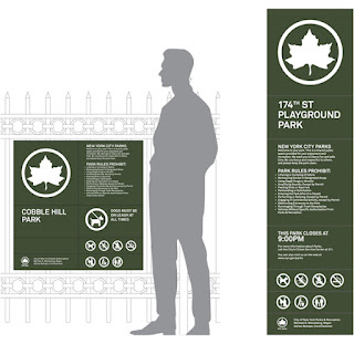
The new system simplifies the graphics and makes them look more contemporary, establishing a unique look for each category and at the same time branding it as Parks. This is achieved through different logo treatments, types of imagery and distinctive color palettes. For instance, Arts & Culture brochures announce their titles on nameplates placed over images of Parks landmarks; Sports and Fitness materials feature icons of various activities, set in patterns of circles and a bright palette of blue, green and orange. Nature division posters combine flat graphics and photography of the natural environment; for Kids, the Parks logo is used in colorful patterns that form animals and objects.


Understanding: 
Information & Way finding... it says it all really, the number one priority would be to make sure its communication is as efficient and distinctive as it can be. It seems the more successful projects have been those that've simplified their graphics, making them look contemporary as well as unique. A lot of it comes down to semiotics and what we apply to each icon.

Product & packaging:
1. http://www.behance.net/gallery/Minimalist-effect-in-the-maximalist-market/1514831
Trying to find alternate simple versions for some package samples of the international brands. Every product needs some review for minimal feeling.


2. A product visualization project showcasing a new and unique way to package honey. A clean, minimalistic logo and branding using a elegant and simple typefaces upon large white space or canvas gives the design a distinctive and sophisticated appeal. This is further emphasized by the gold embossed bee logo. The large white canvas is balanced with the golden warmth of the honey appearing through the glass at the base of the packaging.


3. http://designmuse.typepad.com/
Although I like the overall color palette and treatment of the background the illustration style has the same nineties geometric quality as the controversial logo they designed for the olympics which I don't feel is as dynamic or sophisticated as it could be.


4. I recently came across these Diet Coke bottles designed by fashion designer Jean Paul Gaultier. Very un-diet coke like but fun for the summer just the same.


5. I saw this fun packaging design for Raaka Chocolate. All of the label patterns are hand drawn pencil sketches and add to the homemade yet artisinal feel of the products. 


Understanding: 
Product & Packaging... How a package is designed and packaged has a huge impact on the consumers ability to buy the product. It has the function to look attractive as well as relate to the contents inside. A lot of this area is concerned with aesthetics, colour & style. All the graphic elements must be in play to create a product that also appeals to your target audience which is why product & packaging is such a risky area, many people go over the top and shroud the key information too much, whereas some others are too minimal for even the key information. Minimalism appears to be the new forefront of graphic products as you can see from the examples above!

Branding & Identity:
1. http://www.behance.net/gallery/Shuba/3991475
Corporate identity for a company that offers customers coats of all kinds of fur, and also engaged in sewing of fur coats. There was chosen classic black and white style.


2. http://www.bigfish.co.uk/  A design company that won a gold DBA Design effectiveness award for best branded packaging...


3.  http://snask.com/ Snask is an internationally renowned Design, Brand & Film agency that create the heart & soul of brands. Creating new brands and rejuvenating old ones. They knock off all types of branded material for print, web, film and experimental advertising. 


4. http://www.behance.net/gallery/Weeglow/1988471 Weeglow: The task was to create the brand from the basis, including naming, key visual and corporate identity with basic stationary. Weeglow reflects the young, dynamic mood of people who love playing games. Its freak and casual style exists on every part of the brands image.


5. Mytton Williams: At Mytton Williams we deliver brands. But, for us, brand is delivered through the blend of strategy and design, the ideas and the execution. The one relies on the other.

Understanding: 
Branding & Identity... Communicating a message about a companies aims and ambitions through the use of their products & people. The right branding can see a company over night success. You must understand the companies concepts and theories, with this knowledge you'll understand what message you want to convey to the public. Identifying with a brand shows you understand its meaning, if you get mixed messages about the companies ethics etc, then the whole identity of the company is jeprodised. Brand identity includes: Promotional material, business cards, letterheads, memorabilia, logos, catchphrases etc.


Editorial & Publishing:
Useful websites: http://www.computerarts.co.uk/blog/fond-editorial-design-122866
http://magculture.com/blog/

http://designdefined.co.uk/
http://www.typographyserved.com/
http://creattica.com/editorial/
http://rationedriot.tumblr.com/
http://tranches.tumblr.com/
http://creattica.com/editorial/


For this section we looked over what Editorial and Publishing entailed, We created spider diagrams and split the genre into the different aspects...including: Magazines, Book Publishing & General Publishing, From this we thought of sub categories, investigating the breadth of content that there was... In our blog groups we each picked 2 sections to focus on, I had chosen: Promotional Flyers & Newspapers. I also investigated the different types of Catalogues, Mailshots & Brochures...


Catalogues; Product, Service, Unique, Emails, Incrusted, E-catalogue, Curriculum, Exhibition, Type, Library.


Mailshots; Bulk, Advertising goods, Advertising services, Sales (order forms_


Brochures; Bi-fold, Leaflet letter, Tri-fold, Folder with flap and inserts, Point of sale, Leave-behinds, Sales support tool, Respond to enquiries, Direct mail.

Promotional flyers: Takeaways, Student nights, Music events, Products, Grand openings, Die cut, Special offers, Underground events, Sports leagues, Fundraisers.

Newspapers: Daily, Weekly, National, Local, Tabloids, Broadsheets, 'Berliner' Eurocentric versions, International, Special Interest.

Newspapers have a very broad target audience and the genres often deviate in course with the topic of the stories. Newspapers provide a source of expression for writers. Yet some are more professional in their approach to this, this is what determines one newspaper from the next. E.G. The Sun, middle class, gossip fuelled, bright, eye-catching. The Guardian, minimal, refined audience, Intellectual matters.


Catalogues seem to be much more interactive and playful than advertisements, this can be directly linked to the fact that they're trying to get you to buy the products, therefore they want their audience to have a high sense of involvement, making it more likely that they'll buy something.


When researching into these areas I tried to target brochures that were quite modernist, appealing to the more mature audience. It appears that it is their presentation of the content that is most diverse, Each has its own folding method that corresponds with the attitude of its information.


When looking over the following images I must take into account these key points;

Genres: the overall style of the design, does it say SPORTS, FASHION OR HEALTHY LIVING? ETC.

Content: What does the piece contain, is the information applicable to the imagery etc.


The target audience: Who is the piece aimed at, is it targeting a niche or a wide variety of people? This has to be carefully thought about, For example: a children's book appeals to a wide variety of children, but would still be classed as a niche because it singles out grown ups.


Understanding:
Editorial & Publishing... A very wide and varied area, that cannot be defined by a few words. Editorial design involves the content of a publication, layout of a page, contents etc. For a refined and unique finish you need to understand what informations relevant, what looks good and what communicates well. Everything needs to flow and relate back to the beginning in some form. It seems that getting the right balance between your imagery and text could be the deciding factor for your audiences.

Retail & Promotion:
1. http://new.pentagram.com/2010/11/new-work-im-going-to-saks/
playfully asked shoppers to “Think About…” offerings in various product categories like shoes, jewelry and outerwear. The new campaign is one of action. In advertising and on catalogs, the tagline “I’m Going To” appears in stylish black-and-white arrows pointing the way to the Saks logo, accompanied by declarations like “I’m going to Saks… because some biker chicks have a soft side”


2. http://www.pentagram.com/search/retail/#/446/


3. You can clearly see what the companies promoting, from the simple frosted glass and revealing title. "Comfort is Intimacy’s ultimate goal as a personalized bra fitting can be an intimidating process. The frosted glass window at the entrance provides a sense of privacy and remove from the mall environs as customers make their way to the Welcome Counter. Here, women can make appointments, ask questions or sit and watch educational videos. The counter’s open design and inviting location separate it from the cash wrap and more transactional areas."


4. http://www.greenroomretail.co.uk/#/about


5. http://www.barberdesign.co.uk/
Great design helps you attract new customers, keep your current ones, and boost your profits. And it helps you get your message across loud and clear. "authentic delicatessen in Wantage near Oxford. The partners had decided on a name and ask us to create a full brand identity and communication package, plus a retail environment with the intension of rolling the concept out to further locations in the future.
Working closely with our client, we created a warm friendly and inviting brand that reflected their characters and passion for food. Alongside the brand creation we developed the retail environment to ensure a truly integrated brand offer."


Understanding: 
Retail & Promotion: Getting your design out there has to be the most vital part of Graphic design, If no-one sees your product/ service its useless! It's not just how you advertise but how you execute the format of your retail & promotion. The array of mediums, leaves the opportunity to advertise online, on the television, radio open to creative flare etc. Using the word retail implies a more corporate image of supermarkets, clothes, shoes, electronics etc. Due to the simple fact that there are so many sectors, you need to be adaptable.

About Me

My photo
Leeds College of Art. Graphic Design.
 

Copyright 2010. All rights reserved.