Information & Way-finding:
1. http://meganschierhout.prosite.com/
UP - University of Pretoria, students were briefed to develop a clear and sufficient way finding system for the main campus, the result is a clear and concise colour coded way finding system. (Student project / Information Design / University of Pretoria.
2. http://www.behance.net/gallery/So-Paulo-Zoo-Identity-and-Wayfinding-Proposal/3906085
The purpose of this project was to come up with a fun and more comprehensive identity and wayfinding system for the São Paulo Zoo. They've identified many problems in the actual system, mostly of maintenance and inconsistency. It also didn't seem to catch the users' attention or actually work for wayfinding (signs would only work one way, people still couldn't - even with a map - figure out where they were or where they had to go, etc). There was also a surprising lack of map signs. They decided to start from scratch, then, by mixing a bit of an Art Nouveau influence with some playfulness.
The current zoo way finding system was badly maintained, inconsistent etc...
Pentagram has designed the graphics for the Museum of Chinese in America's new home at 215 Centre Street in New York's Chinatown. The program of environmental graphics we developed for the museum is similarly restrained and complements the forms and materials of the building’s architecture. Identification and wayfinding signage uses the square motif of the identity.
4. http://www.pentagram.com/search/Wayfinding/#/512/
Toronto Pearson Airport developed a new system of way finding and information for the new terminal 1.
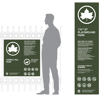
5.http://new.pentagram.com/2011/05/new-work-nyc-parks/
The new system simplifies the graphics and makes them look more contemporary, establishing a unique look for each category and at the same time branding it as Parks. This is achieved through different logo treatments, types of imagery and distinctive color palettes. For instance, Arts & Culture brochures announce their titles on nameplates placed over images of Parks landmarks; Sports and Fitness materials feature icons of various activities, set in patterns of circles and a bright palette of blue, green and orange. Nature division posters combine flat graphics and photography of the natural environment; for Kids, the Parks logo is used in colorful patterns that form animals and objects.
Understanding:
Information & Way finding... it says it all really, the number one priority would be to make sure its communication is as efficient and distinctive as it can be. It seems the more successful projects have been those that've simplified their graphics, making them look contemporary as well as unique. A lot of it comes down to semiotics and what we apply to each icon.
1. http://www.behance.net/gallery/Minimalist-effect-in-the-maximalist-market/1514831
Trying to find alternate simple versions for some package samples of the international brands. Every product needs some review for minimal feeling.
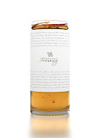
2. A product visualization project showcasing a new and unique way to package honey. A clean, minimalistic logo and branding using a elegant and simple typefaces upon large white space or canvas gives the design a distinctive and sophisticated appeal. This is further emphasized by the gold embossed bee logo. The large white canvas is balanced with the golden warmth of the honey appearing through the glass at the base of the packaging.
3. http://designmuse.typepad.com/
Although I like the overall color palette and treatment of the background the illustration style has the same nineties geometric quality as the controversial logo they designed for the olympics which I don't feel is as dynamic or sophisticated as it could be.
4. I recently came across these Diet Coke bottles designed by fashion designer Jean Paul Gaultier. Very un-diet coke like but fun for the summer just the same.
5. I saw this fun packaging design for Raaka Chocolate. All of the label patterns are hand drawn pencil sketches and add to the homemade yet artisinal feel of the products.
Understanding:
Product & Packaging... How a package is designed and packaged has a huge impact on the consumers ability to buy the product. It has the function to look attractive as well as relate to the contents inside. A lot of this area is concerned with aesthetics, colour & style. All the graphic elements must be in play to create a product that also appeals to your target audience which is why product & packaging is such a risky area, many people go over the top and shroud the key information too much, whereas some others are too minimal for even the key information. Minimalism appears to be the new forefront of graphic products as you can see from the examples above!
Branding & Identity:
1. http://www.behance.net/gallery/Shuba/3991475
Corporate identity for a company that offers customers coats of all kinds of fur, and also engaged in sewing of fur coats. There was chosen classic black and white style.
3. http://snask.com/ Snask is an internationally renowned Design, Brand & Film agency that create the heart & soul of brands. Creating new brands and rejuvenating old ones. They knock off all types of branded material for print, web, film and experimental advertising.
4. http://www.behance.net/gallery/Weeglow/1988471 Weeglow: The task was to create the brand from the basis, including naming, key visual and corporate identity with basic stationary. Weeglow reflects the young, dynamic mood of people who love playing games. Its freak and casual style exists on every part of the brands image.
5. Mytton Williams: At Mytton Williams we deliver brands. But, for us, brand is delivered through the blend of strategy and design, the ideas and the execution. The one relies on the other.
Understanding:
Branding & Identity... Communicating a message about a companies aims and ambitions through the use of their products & people. The right branding can see a company over night success. You must understand the companies concepts and theories, with this knowledge you'll understand what message you want to convey to the public. Identifying with a brand shows you understand its meaning, if you get mixed messages about the companies ethics etc, then the whole identity of the company is jeprodised. Brand identity includes: Promotional material, business cards, letterheads, memorabilia, logos, catchphrases etc.
Editorial & Publishing:
Useful websites: http://www.computerarts.co.uk/blog/fond-editorial-design-122866
http://magculture.com/blog/
http://designdefined.co.uk/
http://www.typographyserved.com/
http://creattica.com/editorial/
http://rationedriot.tumblr.com/
http://tranches.tumblr.com/
http://creattica.com/editorial/
For this section we looked over what Editorial and Publishing entailed, We created spider diagrams and split the genre into the different aspects...including: Magazines, Book Publishing & General Publishing, From this we thought of sub categories, investigating the breadth of content that there was... In our blog groups we each picked 2 sections to focus on, I had chosen: Promotional Flyers & Newspapers. I also investigated the different types of Catalogues, Mailshots & Brochures...
Catalogues; Product, Service, Unique, Emails, Incrusted, E-catalogue, Curriculum, Exhibition, Type, Library.
Mailshots; Bulk, Advertising goods, Advertising services, Sales (order forms_
Brochures; Bi-fold, Leaflet letter, Tri-fold, Folder with flap and inserts, Point of sale, Leave-behinds, Sales support tool, Respond to enquiries, Direct mail.
Promotional flyers: Takeaways, Student nights, Music events, Products, Grand openings, Die cut, Special offers, Underground events, Sports leagues, Fundraisers.
Newspapers: Daily, Weekly, National, Local, Tabloids, Broadsheets, 'Berliner' Eurocentric versions, International, Special Interest.
Newspapers have a very broad target audience and the genres often deviate in course with the topic of the stories. Newspapers provide a source of expression for writers. Yet some are more professional in their approach to this, this is what determines one newspaper from the next. E.G. The Sun, middle class, gossip fuelled, bright, eye-catching. The Guardian, minimal, refined audience, Intellectual matters.
Catalogues seem to be much more interactive and playful than advertisements, this can be directly linked to the fact that they're trying to get you to buy the products, therefore they want their audience to have a high sense of involvement, making it more likely that they'll buy something.
When researching into these areas I tried to target brochures that were quite modernist, appealing to the more mature audience. It appears that it is their presentation of the content that is most diverse, Each has its own folding method that corresponds with the attitude of its information.
When looking over the following images I must take into account these key points;
Genres: the overall style of the design, does it say SPORTS, FASHION OR HEALTHY LIVING? ETC.
Content: What does the piece contain, is the information applicable to the imagery etc.
The target audience: Who is the piece aimed at, is it targeting a niche or a wide variety of people? This has to be carefully thought about, For example: a children's book appeals to a wide variety of children, but would still be classed as a niche because it singles out grown ups.
Understanding:
Editorial & Publishing... A very wide and varied area, that cannot be defined by a few words. Editorial design involves the content of a publication, layout of a page, contents etc. For a refined and unique finish you need to understand what informations relevant, what looks good and what communicates well. Everything needs to flow and relate back to the beginning in some form. It seems that getting the right balance between your imagery and text could be the deciding factor for your audiences.
Retail & Promotion:
1. http://new.pentagram.com/2010/11/new-work-im-going-to-saks/
playfully asked shoppers to “Think About…” offerings in various product categories like shoes, jewelry and outerwear. The new campaign is one of action. In advertising and on catalogs, the tagline “I’m Going To” appears in stylish black-and-white arrows pointing the way to the Saks logo, accompanied by declarations like “I’m going to Saks… because some biker chicks have a soft side”
2. http://www.pentagram.com/search/retail/#/446/
3. You can clearly see what the companies promoting, from the simple frosted glass and revealing title. "Comfort is Intimacy’s ultimate goal as a personalized bra fitting can be an intimidating process. The frosted glass window at the entrance provides a sense of privacy and remove from the mall environs as customers make their way to the Welcome Counter. Here, women can make appointments, ask questions or sit and watch educational videos. The counter’s open design and inviting location separate it from the cash wrap and more transactional areas."
5. http://www.barberdesign.co.uk/
Great design helps you attract new customers, keep your current ones, and boost your profits. And it helps you get your message across loud and clear. "authentic delicatessen in Wantage near Oxford. The partners had decided on a name and ask us to create a full brand identity and communication package, plus a retail environment with the intension of rolling the concept out to further locations in the future.
Working closely with our client, we created a warm friendly and inviting brand that reflected their characters and passion for food. Alongside the brand creation we developed the retail environment to ensure a truly integrated brand offer."
Understanding:
Retail & Promotion: Getting your design out there has to be the most vital part of Graphic design, If no-one sees your product/ service its useless! It's not just how you advertise but how you execute the format of your retail & promotion. The array of mediums, leaves the opportunity to advertise online, on the television, radio open to creative flare etc. Using the word retail implies a more corporate image of supermarkets, clothes, shoes, electronics etc. Due to the simple fact that there are so many sectors, you need to be adaptable.


business cartoon Wow, cool post. I'd like to write like this too - taking time and real hard work to make a great article... but I put things off too much and never seem to get started. Thanks though.
ReplyDeleteThis comment has been removed by the author.
ReplyDeleteTélécharger video youtube A very awesome blog post. We are really grateful for your blog post. You will find a lot of approaches after visiting your post.
ReplyDelete